Pedro Almodóvar once said, “without film-making my life is meaningless.” It shouldn’t be surprising then, that such an auteur would create dramatic and utterly memorable characters. What is perhaps surprising is that while gazing at the stills from his film archives, it becomes abundantly clear that Almodóvar–amongst other things–is also a master at using colour to communicate character development and plot evolution.
Transitioning from powdery pastel hues to violent crimson shades, shifting from austere palettes to vibrant monochromes, the stories unravel at different sensory levels, which might explain the ‘awoken from a dream’ sensation when leaving the cinema after one of his films. With his latest release Pain and Glory in cinemas now, we look back at some of his most memorable characters and their colour journey.
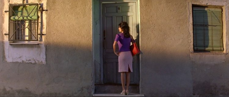
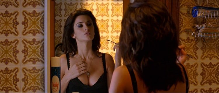
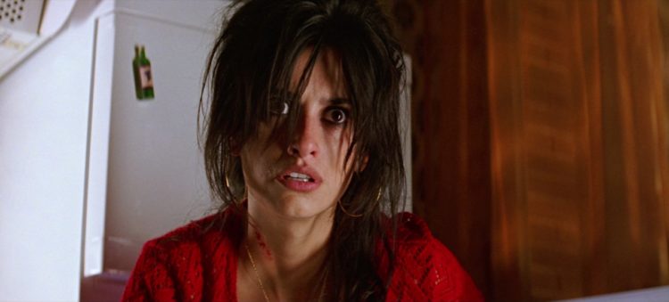
VOLVER | RAIMUNDA
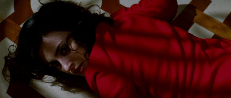
Is it a farce? It is a tragedy? Is it a melodrama? If you find yourself asking these questions, you’ve probably just watched Volver. Bright and hopeful and then decidedly dark and morbid, Volver has the drama of a technicolour telenovela and the disquieting magical realism of a Gabriel García Márquez masterpiece.
At the beginning of the film, Raimunda is seen in sugary shades showing her heartfelt attempt to embody the role of the sweet mother to her daughter in all forms—seen and unseen. But as the unseen takes over the story (no spoilers here) the character descends into darker tones to mimic the shifting tone of the film.
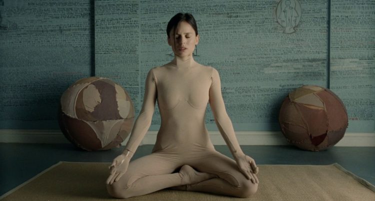
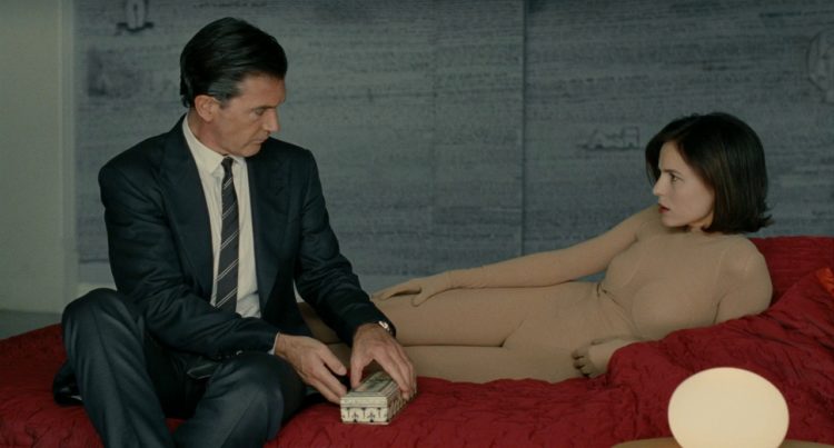
THE SKIN I LIVE IN | VERA
A quiet horror story with sterile scenes of terror juxtaposed with red-hot violence. Created with cold intention, Vera’s nude palette is an act of violence and reflects the absence of colour and choice, not the self-imposed freedom of absence. If that sounds unsettling, it is—The Skin I Live In crawls under your skin and never leaves.
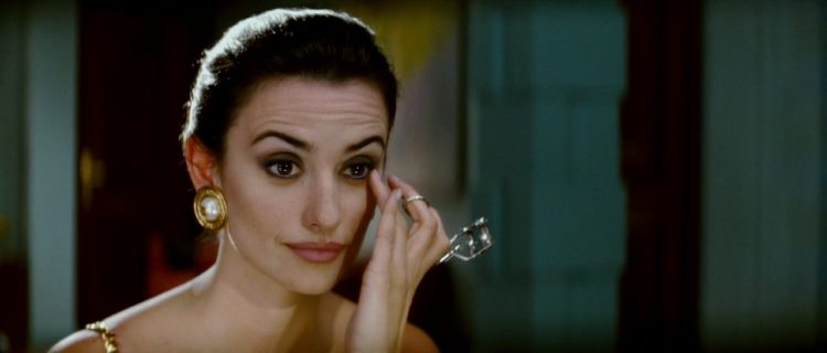
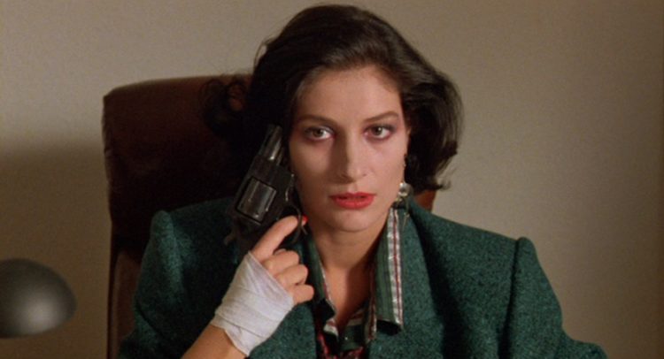
BROKEN EMBRACES | MAGDALENA
Known for being the ‘purest Almodóvar’—although not the best—Broken Embraces is drunk on bright visuals and stylistic hijinks. Almodóvar elevates colour to a staring role with each scene presenting a masterclass in visual language.
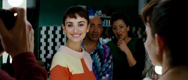
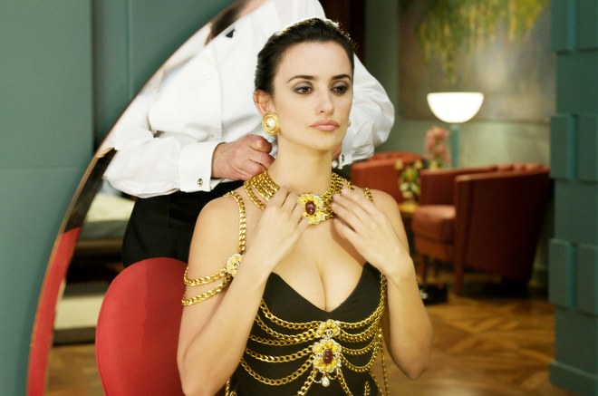
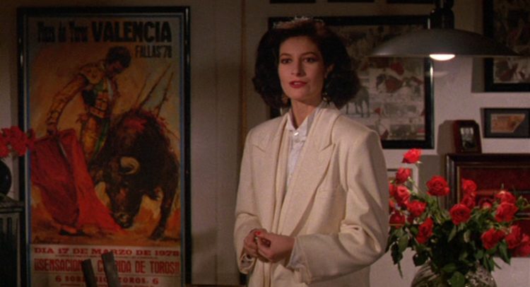
MATADOR | MARIA
Sex, death and religion—the three tenets of almost all of Almodóvar’s films feature especially strongly in the 1986 film that Almodóvar himself later described as one of his weakest. While it might be weak when considering the filmmaker’s prolific canon of work, it’s strong on seductive aesthetics with texture and colour providing a visual richness that smacks of Almodóvar’s aesthetic generosity.
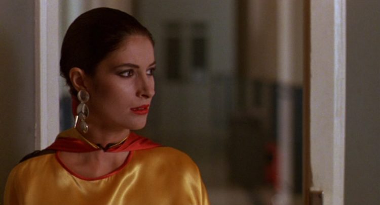
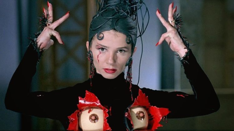
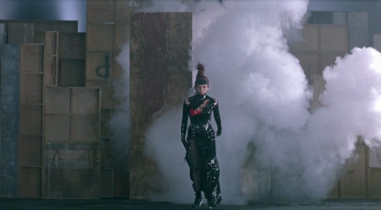
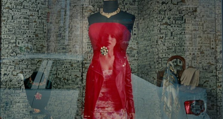
KIKA | ANDREA CARACORTADA
Almodóvar’s first collaboration with designer Jean-Paul Gaultier, Kika features a dark ode to Madonna’s iconic cone bra, which subsequently caused the film’s poster to be banned in the London Underground. With OTT outfits and slick shades of lacquered black and crimson, Andrea lives up to the moniker ‘Andrea Scarface’.